Tuesday 7 May 2013

Negative space - your invisible friend!

Top Art Tip - Negative space, or the space around and between objects, can help us to draw their form and their relationship to each other accurately. 

e.g in this drawing of my cat hiding in a shoe box, I have drawn the shape between the tail and the body, and the triangle between the lid and the box, to get the cat and the box correct.


In this drawing of cheeseplant leaves, I have drawn the shapes of the holes - ie. the spaces in and around the leaf - to get the leaf right. 


If you carefully draw the areas around and between parts of your object, rather than the object itself, this will help you to draw those shapes much better. It stops your brain wrongly editing shapes back to the symbol we have learned.

So to get this gymnast and her ribbon right, concentrate on the spaces between her limbs and body, and between her and the ribbon. ie. draw the shape of the sky seen between and around the main features.


For example - if you are drawing a jug or basket with a handle, drawing the space between the handle and the jug will help you to draw the jug /basket and the handle correctly.


If you are drawing a still life, or any group of objects, people or animals, get the shapes of the spaces between them right and you will get the objects themselves right.

Look at the shapes against the white table, and against the dark background - get these right to get the objects right, and in the right place. They are often little triangles , often curved triangles.


Here you can see the dark background - draw this correctly and the objects will be the right shape and correctly placed against each other.

In each of the following still lifes, look at the shapes around and between the objects - often little V shapes or triangles.


 If you are drawing a chair, try drawing the space seen between the legs and bars - this will help you to get the chair right. 


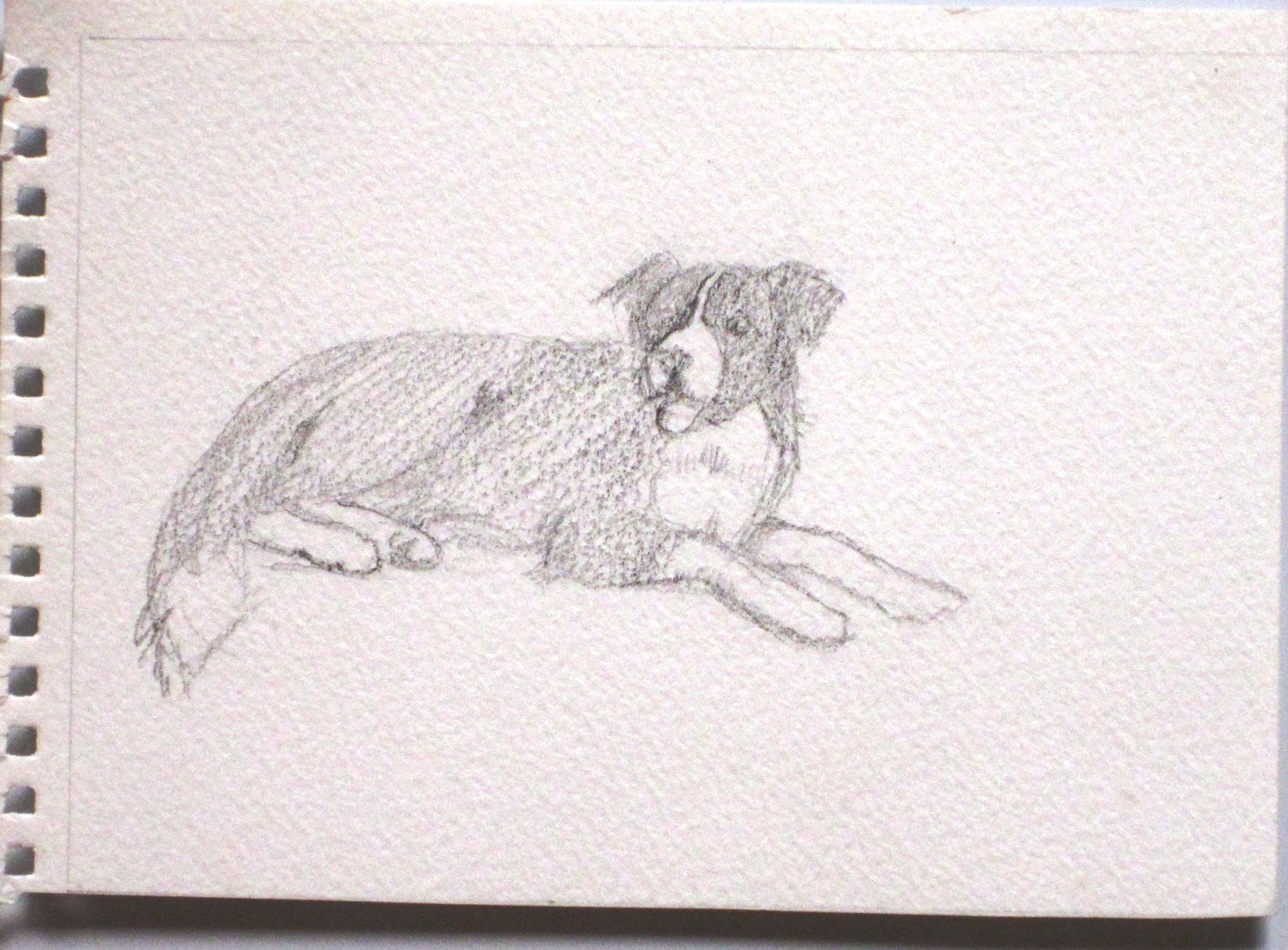
If you are drawing a person seated, draw the shapes of the spaces made between the limbs and the body and your drawing will be better, and easier to do. I have highlighted these negative spaces in black here:


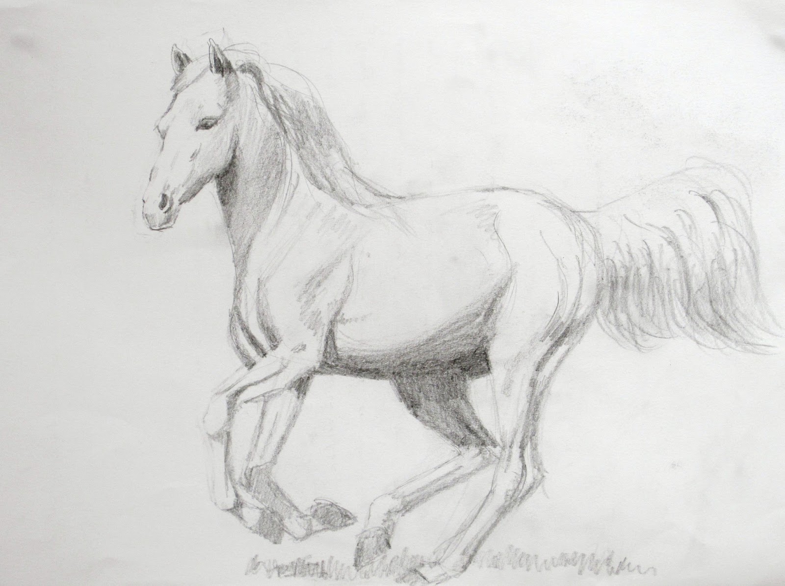
If you are drawing this horse galloping towards you, with all those limbs foreshortened, focus instead on the shapes in green, the grass seen between the limbs. 

Another trick is to get his silhouette right before you draw the details. This will help you cope with that foreshortened body and neck.


Draw the shapes between his legs and body correctly:


Draw the shapes seen behind the rider and horse - almost as if you are drawing the sky seen    
behind them, between the bodies and limbs of horse and rider.

Here, I have carefully observed the shapes seen behind the horse and foal - ie. the shapes of patches of pale blue sky and pale gold foreground.


So Negative space is your invisible ally in drawing well! 


Thursday 25 April 2013

Distortion - keeping it to a minimum!

We all tend to distort when we draw - partly because we are no longer actually looking at the shapes in front of us, but instead we draw what we think should be there.

All of us learn symbols for things in childhood, and think we know what a human face or a cat's face looks like, or a human eye, or a hand, or an arm, etc etc...

But as soon as these things are seen from a different angle, e.g foreshortened, we stop looking at the actual ( strange ) shape in front of us and tend to draw our own symbol instead. The foreshortened version seems too difficult, too odd.. ( although of course it is correct.)

This explains the tendency to draw a human face with the eyes too high up and the nose too long, when in fact the eyes should be half-way down the face: 


In other words, on the left the artist has drawn an incorrect symbol learnt in the past, not  what is there. 


Other common errors: drawing a cat's or other animal's face ( especially the eyes and nose) like a human face
because the artist has learnt a symbol for an eye or nose and draws it willy-nilly, regardless of what is there!


Also, as soon as things are seen from a different angle, e.g foreshortened, we stop looking at the actual ( strange ) shape in front of us and tend to draw our own symbol instead. The foreshortened version seems too difficult, too odd.. ( although of course it is correct.)

e,g,Drawing a hand without foreshortening the fingers which should be pointing towards you:


 Wrong - this is pointing the wrong way! No foreshortening - 
the artist has drawn what he or she thinks a finger ought to look like. 

Now with the finger foreshortened and pointing towards us, we know who our country needs!


Drawing an arm or a leg without the foreshortening it needs: here the artist has drawn his or her symbol instead of what is actually seen:


Drawing an eye from the front when drawing a profile: ( ie. drawing a learnt symbol for an eye, instead of what the eye actually looks like from the side ):


Top Art Tips to avoid distortion include:

1) Turn the photo and your drawing upside down and continue drawing - your brain will be unable to " correct" the strange but accurate shapes you are seeing.

2) Grid your photo and your drawing - this constrains the proportions. The more squares in your grid, the more accurate your drawing.

3) Measure by using your pencil as in lesson 3 - compare the width and height of a figure, or  a vase, for example. Or how many times does the head go into the whole figure? or into its width?  etc.

4) Draw horizontals and verticals to compare your angles against.

5) Half-close your eyes as you look at the model and then draw only the silhouette        ( e.g of a foreshortened arm or hand or leg) and then complete the details afterwards. 

6) Look at your drawing in a  mirror- this reveals distortions.


Sunday 21 April 2013

Trick to keep your drawing correct- gridding


Top Art Tip to keep your drawing correct and undistorted Gridding.

 1)    To keep proportions correct when working from a photo you can grid the photo and your drawing paper:

First make sure that your photo and drawing paper are in proportion with each other by checking that they share a diagonal - see below. 

Then where that diagonal crosses the edge of the paper, rule a line to remove any excess paper.


Your photo and your drawing paper are now in perfect proportion to each other - if not, your drawing would be distorted, as in a fairground mirror, too high or too wide!


 2) Top Art Tip:    A simple grid ( e.g for a landscape) would be to quarter the photo and to quarter your drawing paper. Then copy the shapes inside each quarter - larger of course, if your drawing paper is larger.

  You will have to guesstimate - is your drawing paper twice as big? half as big again? etc. The lines and shapes will also have to be twice as big, or half as big again, etc.


 3) Top Art tip:    Where more accuracy is required, especially for an animal or a figure or face, draw more squares. e.g divide each quarter above into quarters. 

or better, grid a sheet of acetate using a permanent black overhead projection pen. The squares could be 2cm or even 1cm for a face.

Tape this over your photo. Now on your drawing paper, lightly rule squares the same size ( for a same size drawing), or 3cm or 4cm squares for a larger drawing.
Simply copy the contents of each square onto your drawing paper then rub out the grid lines.

Top Art tip: This has been done for centuries ( using black thread or wire in frames, not acetate sheets!) and should produce a perfect likeness if done with care.


Wednesday 10 April 2013

Fast and loose

Top Art Tip: Sketches often look better than finished drawings or paintings precisely because they leave something to the imagination - the viewer completes them in their mind's eye, which is very good of them! So allow them to do so by not drawing or painting too tightly. Compare Constable's oil sketches with his finished work.


Note the uncorrected lines above where I have been searching for the form. 


An overworked drawing or painting looks dull, sterile, dead, 

But if your work looks as if it was done with speed and flair, it has expression and life.


Top Art Tip: set yourself a time limit for each session or each sketch. This could be half an hour, an hour, an hour and a half..etc.   I would suggest 2 hours max as you will be tired after that and could be getting bogged down. Get as much down on paper as you can within the time allowed. Don't worry if parts of it look messy or unfinished; just make sure the focal point is good enough. You can decide whether or not to work on the other parts another day- it may be better not to.


Top Art Tip: After the first session you will know whether it is worth taking a sketch to a more finished state or not. You can leave most of it loose, just finishing the focal point.


Top Art Tip: you don't have to erase every incorrect line. Sometimes having several lines with the main one emphasized gives your sketch movement and life. Look at these examples by another artist ( not me) where you can see the artist has been searching for the form, feeling out the form of these hands and feet...normally notoriously difficult to draw, but the artist has "constructed" them before going into detail...


Sunday 17 March 2013

More sketches!

Here are some more sketches for you to see : click on any picture to see it enlarged.

 Plant on stool, 
                                                                                                watersoluble and waterproof ink

My dog, pencil sketch

 Allotments, ink and wash

Rocking chair in pencil and watercolour  

  Summer's day, watercolour

Carcassonne, watercolour


 My cat Zoe, watercolour


Riding school, felt-tip 

 Local view in Spain, pastel

Four views of Lake District mountain in different lighting conditions

 Lake Windermere, oil pastel and watercolour

 Flowers from my friend's garden, watercolour

Two pages from my Egyptian watercolour journal


Oil sketch, Les Rotes, Costa Blanca

Tuesday 5 March 2013

Current work - flowers, Feb 2013

To move on from painting snow the watercolour class wanted to do something more Spring-like, so we are painting flowers. We are learning to " cut out" flowers and leaves from a wet-in-wet background by painting darker behind them. We also tackled a Spring-like view of Lake Bled in Slovenia, with its fairytale spire.

Marguerites 1

Lake Bled, Slovenia

Lilies in a French house

Marguerites 2

Spring flowers

Poppies, daisies and cornflowers in a cornfield


Lilies in soft focus

and here you can see the progress of my latest animal painting, a lynx, in pastel: